Turley Case Study
Taking a refreshed visual identity online
After modernising their visual identity, Turley appointed Sputnik to evolve it for use online.
Extending print guidelines for digital

The application of an organisation's logo, colour palette and typography defined in the offline visual identity guidelines together form the foundations for application online. It is necessary to extend the guidelines for digital to ensure consistent application across screen sizes and devices, and to create new styles for elements such as hyperlinks, form fields and navigation.
A print canvas is a fixed size, and the proofing stage will highlight any content or layout issues. While there may be a handful of standard screen dimensions, users needn't have their browser open full screen, so there are effectively thousands of viewport sizes to cater for.
After the client signs off a beautiful design based on a 1200 px wide grid, it's vital that the web team has already identified and planned for any elements that resizing, stacking or hiding are required at different sizes.
In print, type can be meticulously laid out inside intricate shapes. As if converting this to the web isn't difficult enough, we need to consider what will happen with the client fires up the CMS and puts in far more content that the design was intended for.
Digital assets need to consider interactions where printed materials do not. Buttons and links have hover and visited states, which usually require additional styling.
Similar consideration is required for form elements which have focus states, and various options for validation and tooltips.
This leads onto transitions, where we change elements over time, something a print guideline document will not consider. Micro-interactions and animations all require transitions, which need defining.
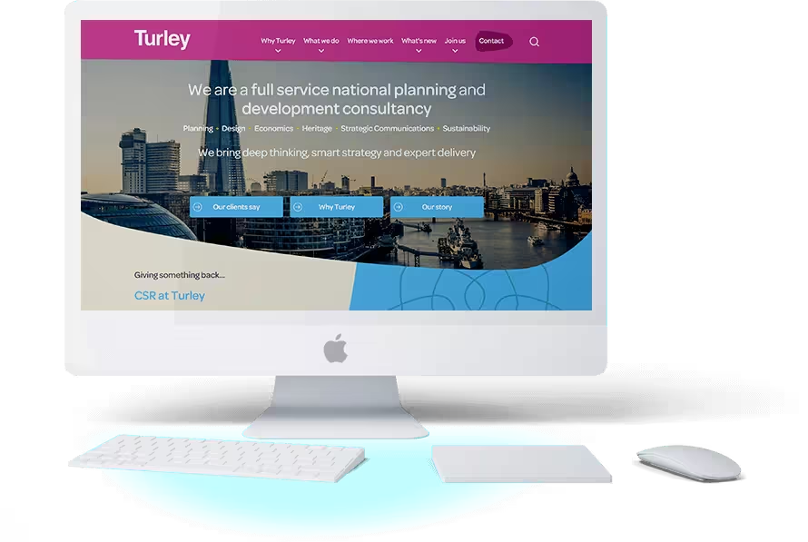
Turley and the visual identity refresh
Turley is a full service national planning and development consultancy. In 2017, Core Marketing worked with Turley to refresh its visual identity.
We were commissioned to take Core's work, which was predominantly print, and convert it to digital. We were delighted to be asked to help realise Turley's new online presence from the ground up.
Application examples
The following are examples of the application of the print guidelines to the user interface
Constraining content within shapes
A common print technique is to use brand shapes to contain image or text content.
It is possible in print, where the designer can work with fixed content and precisely adjust scale, leading, kerning and font size to place content within a shape.
With responsive websites, the size of the container can vary, and the content may be editable in a CMS.
There are technical ways to manage this issue, such as using Javascript to measure the size of the container and adjusting the content to fit.
However, the organic shapes used on this project were so numerous, and the risk of content variation so significant, that we introduced a new style for use online permitting the positioning of content over a shape instead of inside.
As with all extensions of the visual identity guidelines, it’s important to ensure they remained sympathetic to the existing styles.
Rollover effects
To further user engagement, we designed a persistent footer panel containing links to Latest News, Showcase and Join us. The links use organic shapes from the visual identity guidelines.
We included an image zoomed combined with a colour overlay transition.
Text input
The signup form places the input field labels (the names of the text boxes) inside the field.
While there are a number of advantages including consistent alignment and efficient use of page real estate, it does introduce a consideration around what should happen when the user puts the focus on (clicks inside) the text box.
Leaving the label visible would would conflict with what the user was typing, and hiding the label would be unhelpful if the user needed reminding what field they were on.
The solution is to shrink the label and keep it visible.
Each field also has inline validation providing immediate feedback to the user as they progress through the form if their input is not permitted.
SVG masks
SVG is a vector image format allowing the shape to be scaled without loss of quality.
Vector images are created using equations rather than pixels, so, like zooming in to a fractal, the image will always appear crisp.
A mask is where an image (photographs are normally rectangular) is placed inside a shape, resulting in the image being cropped by the border of the masking shape.
By using an SVG shape as a mask, the mask can scale and allow the cropped image to alter scale as the web page responds to changes in browser size.
How SVG masks are used and how content sits within them should be defined and incorporated in to the guidelines.
Micro interactions
Micro interactions add to the experience of using the Turley website. We paid close attention to the animation of the burger menu for mobile devices, ensuring the icon, and the slide-out menu itself, had a smooth transition.
Smooth transitions
The extra effort required to enhance “on / off” hover states with subtle animations helps create a delightful user experience.
Although the development team are responsible for an optimised implementation, ownership of transitions rests with the designer who should ensure they are consistent, and become part of the digital brand guidelines.
Lengthy, repetitive or over-used transitions will negatively affect the user experience of the site, and perception of the business.
The result
Side by side comparison
The result is a responsive feature rich website, powered by Drupal 8 Content Management System. The site is a radical transition from the old site, both in terms of visuals and usability.
Don't Just Take Our Word For It
It was apparent from the start that applying our new visual identity online would require an agency with expertise across brand, user interface design, front end development and Drupal integration.
Sputnik's reputation for innovation, problem solving, enterprise development and pragmatism made them the clear choice as our digital agency partner.
Carol Maughan
Head of Digital Communications
Turley
Let's work together.
Call our Managing Director Andy on 0800 680 9777 or fill in our to discuss how we can help.